Few concepts done for tech packages 2023


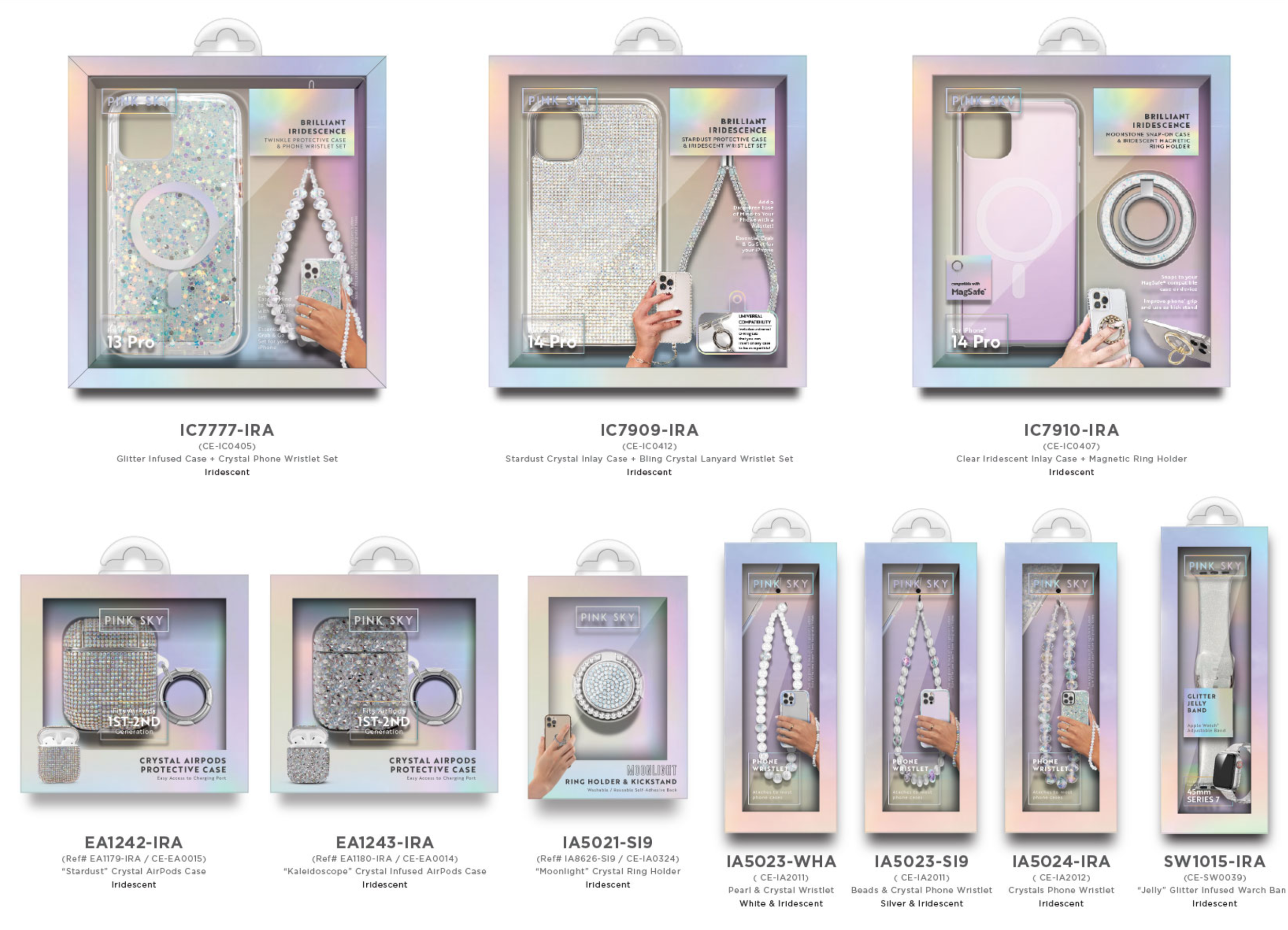


Few concepts done for tech packages 2023


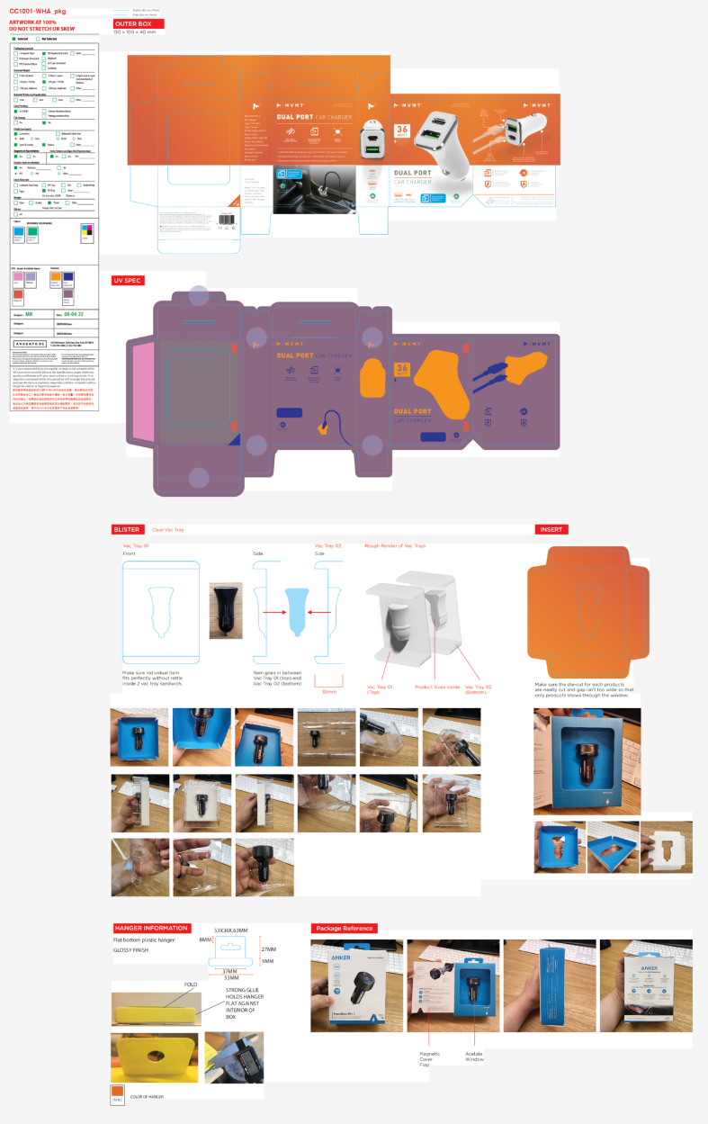


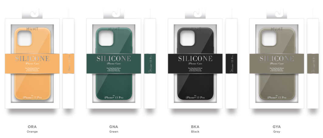


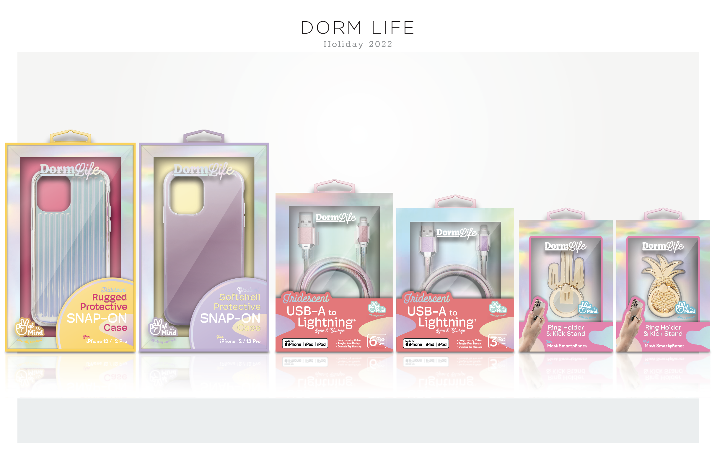


Portable Party Speaker (boombox)

Karaoke Trolley Wireless Speaker


My Kami :)
Ah, one of my favorite developments to do :) I love designing for pets. Probably because I take care of a beautiful black cat and I just adore and cherish their existence. I believe they make world better place.
I went on, sketching ideas, preparing sources and designing blue prints for the packages.
It is always challenging obstacles that you need to overcome when you design for kids or pets.
There must be a better way than selling “cuteness” to the customer. Blending the whole theme of the package and information it needs to provide is the key to successful kids and pets packaging, I think.
Instead of putting popping colors and cute/simple graphics over the package, I always add “themes” to the package so that package would feel more welcoming instead of aggressively approaching to the customer.
some of the original ideas carried over to the final design but after few brain storming session, I decided to omit and simplify the packages little more before finalizing them. I loved the whole look of finalized packages but since some of them will be displayed in wholesale stored, they needed to be in set or had certain amount of quantity per shipment.
Some of the renderings for our customer :)
That time of the year when wind gets cruel and NY becomes the winter wonderland. We were requested to develop new packages of all sort of Cold Weather Accessories (gloves, socks, beanie, scarves, etc).
First, as always, I wanted to think out of the box and started sketching some ideas on the paper.
There were many items that we need to consider packing and some of them were as a set.
There were some restrictions designing these packages because they should fit into limited space and need to be certain price point and quantity.
This particular project was really fun and challenging to do. Some of them were ended up just as concepts but few of them have potential to be actual products you can buy from store! I inputted ideas that are customer centric. If they can see products inside the packaging well, if they can feel the fabric and check for themselves if this product is what they needed to get over the cruel winter times, if they can clearly see what products would look like, even function to try them on.
These are some renderings I did for customer. They wanted to see how our package would look like on the actual store floor.
I had a great opportunity to work on a new kids packaging for 3 T shirts package.
Our team researched on-line and off-line market, prepared mood board for our new kids package.
It was for members-only club program. We narrowed this development down to two types of packaging ideas. Wrap board style belly band package and Hanger package.
After brain storm session and discussions, our main goal was to present all 3 different colors of the t-shirts to the buyer clearly and comprehensibly. Original folding was solid and sufficient but we wanted to do more with this package while developing.
I came up with this new-kind of folding way. It presented all 3 colors at the same time and by having a uni-body design, it was durable enough to withhold 3 kid's t shirts and quite stack-able for the nature of member's only wholesale club. They will be stacked up by colors or sizes on top of large tables (so called Table Program.)
I didn't want to stop there and went further with an idea of re-usability of the package.
My first initial idea was to add Stickers or Sticker pack (as hang tag) with the package on certain theme that might go well with kid's packaging. It would add more value and unique feel to it instead of being a wrapper for the products inside. After research, I came up with theme of "Playground". Who doesn't like playground.
I developed two packages with the same theme. Belly band and Hanger.
They quite went well with the selected theme and quite fun to look at. My new folding way idea was selected as final and we developed deeper with it and our whole team worked on few different designs for the final meeting with buyers.
Another idea was added later from upper management. "Drawing board".
I maintained the theme and finalized the package mock-ups.
Last photo is showing other designers' design on my specs.
It all started from here.
It was a complete non-sense concept design I previously did while developing new package designs for base layer. While upper management executives were preparing for big meeting and try to decorate the showroom, they wanted to see something new. This "Cylinder" type of package was taken to consideration and they asked us to do more of it with provided information.
Since the products were winter base layers, I took literal representation and took inspiration from a modern day heater. Cylinder shape kind of expressed the modern and sleek looking, Silver grate added more to it to make it "hotter" and "heat" related. Minor photo manipulations and bit of patience, I came up with this design and proceed to fully featured mock-ups for the presentation.
Here are some other options done for the presentation. Other designs were result of our whole team. It looked great together and made huge impact while I was doing presentation for upper management.
I wanted to design packages that are informative and cool to look at.
Not just the aesthetics but I wanted to incorporate colors and shapes to express that "cool" feeling since the products in them is to keep the wearers cool and dry.


I made simple presentation board instead of making actual mock ups due to time constraint.
Presentation board showing two options with production quality lamination and materials used, also added some mood board / inspiration images to help the viewers understand better where my ideas came from for these package designs.

I wanted to design two totally different look and feel package for my options.
I researched based on the product that I was given and worked on concept design first.
I always loved sketching my ideas, old school fits me.
After few days of gathering ideas and research, finally narrowed it down to 2 designs that are far from each other and yet shares similar aesthetic.
First, I made rough draft mock up to check the specs and integrity of the package first.
They were all solid! Packages hold the products in tightly and securely. They were firm and sturdy. I moved on and made package mock ups for presentation.
In my research of "Lounge Set" package that contains 2 or more garment products inside, many cases, I found the package seems to be some what "incomplete" or unsuccessful to present the products properly. Most of those packages were lacking in execution and felt bit flimsy in my hands. So I came up with 2 ideas that can fix these issues.
I was looking for a shape that can promote the products inside. Package not only serves a purpose of containing the products, but to present the products as well. This kind of welcoming "Arch" shape supports the Crew neck of the product, so that the package subtly ushering to it. It is tightly sealed from the sides and newly configured folding ways help when holding the package, you can feel the solidness and pleasurable weight to the product.
My 2nd option was to use elastic bands to hold on 4 sides. This method might cost more than just a simple packaging, but it will triple the aspects of security, presentable and easy to recognize. Elasticity by nature can expand to match the size of the products inside. It can easily hold XS to XXL without changing the whole packaging which is a breeze for our production team :)
First off, HI.

It was obvious for me to this kind of design when I received the product sample from the design team. It was kind of a long shot, but I did it anyway.
I came up with this idea and went on from it
I prepared total of 3 completely different designs of the package. gradually being main-streamed. I designed new hang tags for each packages, new icon designs and "Easy Leash Access" hang tag from the back side (pics to be updated) to let the customers acknowledge the feature.
It was a really fun project, they all loved the concepts of the packages. We discussed and came up to a single concept design for a big meeting with buyers. This is the finalized design and concept for our Puppy product for new season!
Well, our team's initial approach to this package was a simple wrap-board around the pouch itself. However, we received a request from the buyer that they prefer solid box package so that they can stack them up on their store floor.
So, I went ahead, transporting all the design aspects to a box shaped package. Measure the correct size for it and dived in to designing. I came up with one layout and our team worked on the 2nd version. I spent all after noon making actual full featured mock up for the buyers to see. Crossing my fingers for good sales :)
We had to design a new zipper bags for our best seller!
It is a package for Men's base layers (Top and Bottom).
Our whole team was working on it and my job was to create something that is completely different but still serves the purpose of presenting our best seller to the masses.
I started sketching and designing while brainstorming.
I narrowed my designs down to two versions.
• incorporating very basic and simple packaging using minimum colors, easy to recognized.
• Using shinny silver foil and layout to gather attention and have fancy back side.
I grabbed my mouse and started designing them digitally using Illustrator.
I felt the need that these options were best to be presented in real life.
We hoped that my presentation shows some solid and actual feel of the package.
Also wanted to test out the package options in real life.
I started with 2 basic concept for this new package.
1. Something very minimal and sharp looking package.
2. Play with some of the existing idea.
So i came up with some sketches as always.
During my research, I found some of the reference packages done already in the market and tried to mix up some new ideas that suit the company's concept.
Finalized the sketches into feasible package designs and made some miniature mock ups.
Also did some color studies on one of them, because the first draft didn't quite hit the mark as for aesthetic aspect.
I loved the looks of one of the designs, I decided to go little further, trim it down, make it simple and actually have product merit in the market.
So I finalized the design and made full featured mock up for up-coming reviews and meetings.
One of our customer requested the current polo package (box) to be updated.
Previous one had some flaws and issues.
I wanted to avoid any separated pieces, giving it more durability and adding aesthetic features that can express "New" and "Update".
I explored some ideas and features, sketching through freely.
As always, I make scaled down dummies to double check on the structure integrity and try to find any issues and flaws that the full scaled package might encounter.
Because of their "unique" structures, I had to make many minor changes before I finalized the package design.
After proving their structural integrity and merit, I made full featured mock-ups right after.
I needed to develop a package for Travel blazer.
This blazer had lots of features specialized in traveling, wrinkle-free and such.
We had great mesh zippered bags developed while back, we decided to use the advantage of it being travel-friendly.
I came up with an idea and expanded into few options.
Decided to pick one and made full featured mock up.
I wanted this package to have very eye-catching elements.
Shinny Silvers around the edge, popping neon red colors and interesting shape.
Yet, the package needed to be durable and flexible to hold two garments that are heavier and thicker than usual.
I used a reinforced elastic band with metal tabs to hold the package together while giving it a flexibility the garments required.
First reaction for this package was really good!
I ended up making few more full featured mock ups to send out to customers.